
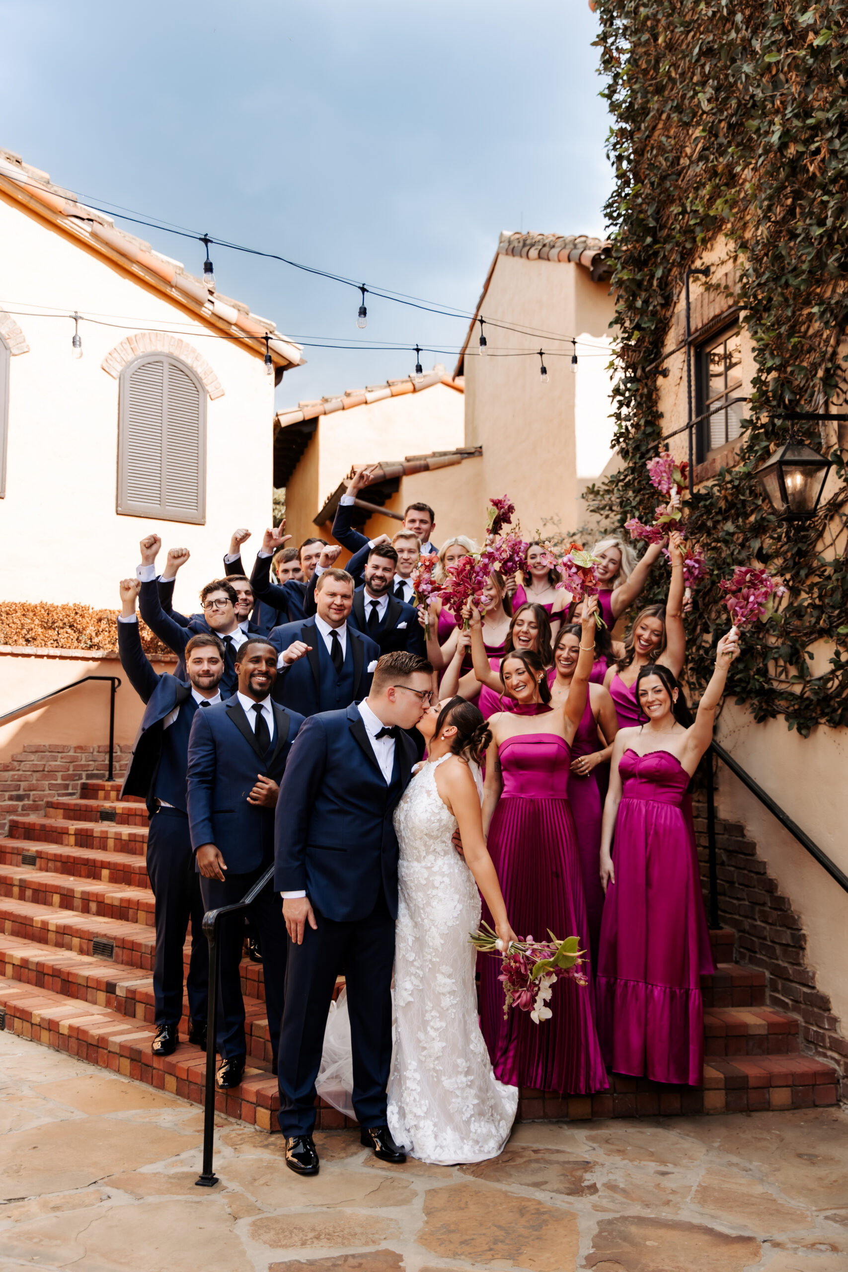
A Bold, Colorful Bella Collina Wedding: Erin & DJ
Some weddings are a perfect reminder that luxury wedding stationery does not have to feel traditional or expected…
Erin and DJ’s wedding at Bella Collina was colorful, bold, playful, and full of personality from the very beginning, which made it such a fun celebration to design for.
From the very beginning, their wedding design was colorful, bold, playful and full of personality. Fuchsia and chartreuse were the stars of the color palette, with stripes, unexpected shapes and graphic details woven throughout the celebration. Nothing felt overly serious or traditional but everything still felt polished and intentional.
And that balance is probably my favorite thing about this wedding.
Starting With the Invitations
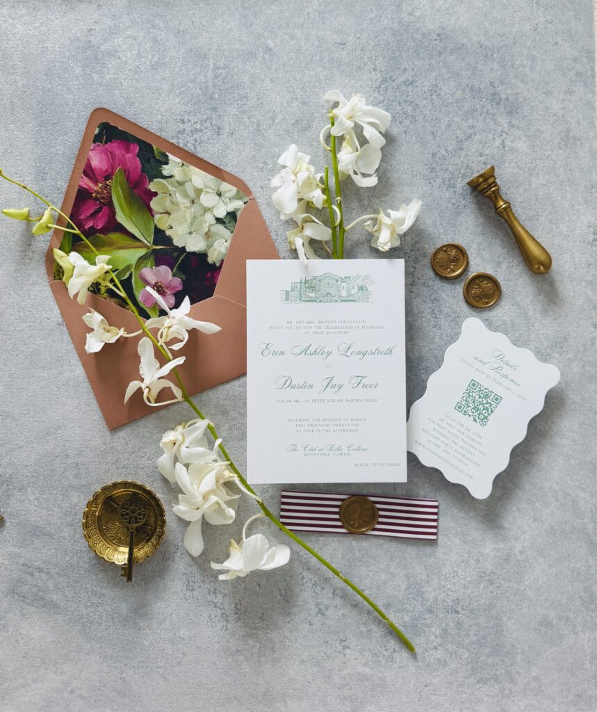
The invitation suite gave guests the first little preview of what Erin and DJ’s wedding was going to feel like.
We leaned into their bold color palette right away, using fuchsia and chartreuse along with playful shapes and graphic details. We also created a custom line drawing of Bella Collina for the invitation itself, which gave the suite a strong sense of place and made the design feel that much more personal to their wedding.
One of my favorite details was the custom envelope liner. We brought in their signature colors with just a hint of florals, so opening the envelope felt like its own little moment before guests even reached the invitation.
The suite was finished with a belly band and wax seal, which added texture and a touch of formality without taking away from the playful feel of the design.
I love this combination because it shows that luxury wedding stationery doesn’t have to mean ivory paper, delicate florals, and muted colors. Luxury can be colorful and fun. It can include a hand-drawn venue, a bold but still romantic liner and unexpected details. What makes it feel elevated is how thoughtfully everything works together and how specifically it reflects the couple.
Bringing the Design To the Wedding Day
Once we had established that visual language with the invitations, the goal for the day-of stationery was simple: keep it going!
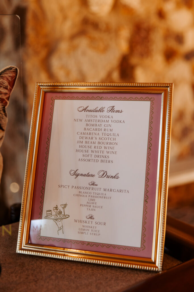
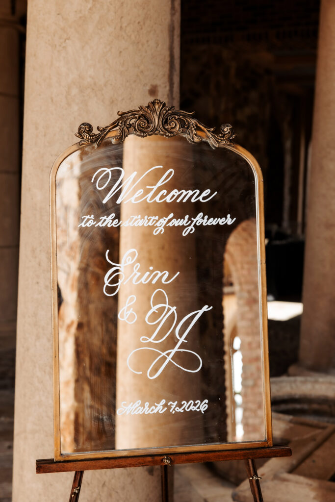
I created personalized menu cards, ceremony programs, welcome signage, seating charts and bar signs for the wedding. Throughout each piece, we pulled in the same bold colors, stripes, shapes and overall sense of fun.
This is one of the reasons I love designing invitations and day-of pieces together. Instead of every sign or paper item feeling like its own separate decision, we can build on what we’ve already created.
The invitation becomes the beginning of the story, rather than something that disappears once it goes in the mail.
A Seating Chart Inspired by a Dinner Party
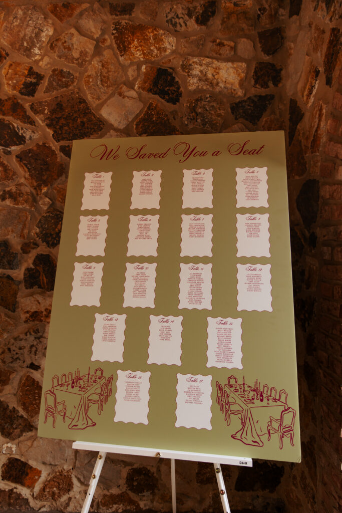
The seating chart might have been my favorite piece from the entire wedding!
Rather than simply listing names and table numbers, we added hand-drawn tables to the design and copied the wave outline found on their programs and in their invitation suite. It gave the seating chart the feeling of looking down at an actual dinner party, which felt so right for Erin and DJ’s reception.
It was playful without feeling gimmicky and it helped reinforce that warm, celebratory dinner-party atmosphere they wanted to create.
Sometimes those are the details that make a design feel the most personal. It doesn’t necessarily have to be a huge custom illustration or an elaborate installation. A small design decision can completely change how a piece feels!
Personalized Menus With a Practical Detail
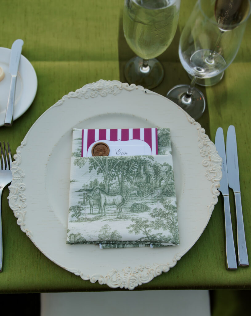
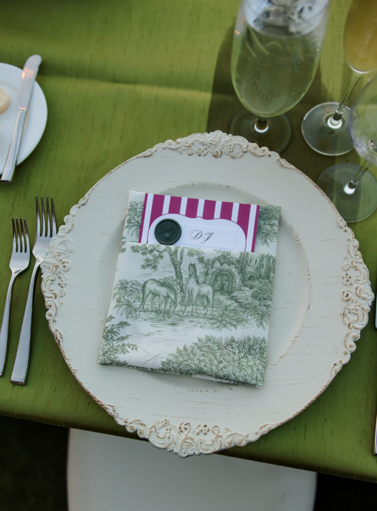
Each guest also received a personalized menu card, but these weren’t only there to look pretty.
We used wax seals on the menus to indicate each guest’s meal selection. It’s one of my favorite ways to combine design and function!
The banquet team gets the information they need, guests receive something beautiful and personalized at their place setting and we don’t have to add a symbol or abbreviation that feels disconnected from the rest of the design.
The wax seals became part of the overall look instead of simply serving as a meal marker.
Personality Is What Makes a Wedding Feel Personal!
One of the things Erin and DJ’s wedding did so well was lean into who they actually are!
We weren’t trying to make their stationery look like anything but them. We weren’t choosing colors simply because they were trending. And we definitely weren’t afraid of fuchsia and chartreuse.
We used the stationery to help tell the same story the rest of the wedding was telling.
That is something I always encourage couples to think about when we begin designing. Your wedding stationery doesn’t need to fit into a specific idea of what a wedding invitation is “supposed” to look like.
Maybe your personality comes through in an unexpected color combination. Maybe it’s a stripe, an unusual shape, a custom drawing or a very specific font. Maybe your wedding is classic and romantic. Maybe it looks like the most fabulous dinner party you’ve ever thrown.
The goal is not to add details simply for the sake of adding them.
The goal is to make thoughtful choices that make the wedding feel like yours!
Luxury Wedding Stationery Can Still Be Fun!
When people hear luxury wedding stationery, they sometimes picture something very traditional. Heavy paper, neutral colors, formal scripts, maybe a monogram.
And I love all of those things!!
But Erin and DJ’s Bella Collina wedding is such a good example of another side of luxury stationery…
It can be bold.
It can be colorful.
It can have stripes.
It can play with shapes.
It can feel like a dinner party.
And it can still be beautifully designed and completely appropriate for an elegant wedding.
To me, luxury is much more about the level of thought behind a design than following a certain aesthetic.
If you’re planning a wedding in Orlando or throughout Florida and you want your stationery to feel cohesive and luxurious from the invitation all the way through the reception, I would love to help you build that story!
Whether your style is colorful and playful like Erin and DJ’s, romantic and traditional, modern and minimal or something completely different, we can create invitations and day-of details that feel intentional, personal and unmistakably yours.
Because sometimes the best wedding design starts when you stop asking, “What are wedding invitations supposed to look like?” and start asking, “What would feel like us?”


Vendor Team
Planning: Couture Couture Weddings | www.couturecoutureweddings.com
Photography: Clare Gratz Photography | www.claregratz.com
Venue: Bella Collina | www.bellacollina.com › weddings
Wedding Stationery & Day-of Details: Rosebud Calligraphy & Design | www.rosebudcalligraphy.com
Leave a Reply

A Florida Calligrapher and Stationer That Loves Pretty Lettering
MEET KATHERINE

So glad you’re here! I’m an Orlando designer (but a Texan by heart and birth) providing wedding stationery and signage services. I will always say yes to a glass of champagne, sushi, and a good walk! Let’s see if we have anything else in common…
Explore
Recent Posts
Ready to work together?
I take on a limited number of weddings to ensure each project receives the care and attention it deserves. Your date is officially reserved once your proposal is accepted and the retainer is received. Feel free to reach out to check availability or to learn more! I’d love to hear what you’re dreaming up.


Leave a Comment